Primary Color Blocking

Spring is finally here and I'm so excited to bring more color back into my wardrobe. Check out Pantone's color picks for spring 2017 for some inspiration this season! When it comes to the color blocking trend, you might get stumped at what colors to even start with. It's all about choosing colors that work well with each other, like primary colors (red-yellow-blue), or complementary colors (orange-blue or red-green). Take a look at this site for some basic color schemes that can help you get started with color harmonies. While you pull all the colorful pieces from your wardrobe, don't feel afraid to experiment! You'll find that there's no need to be afraid of color.
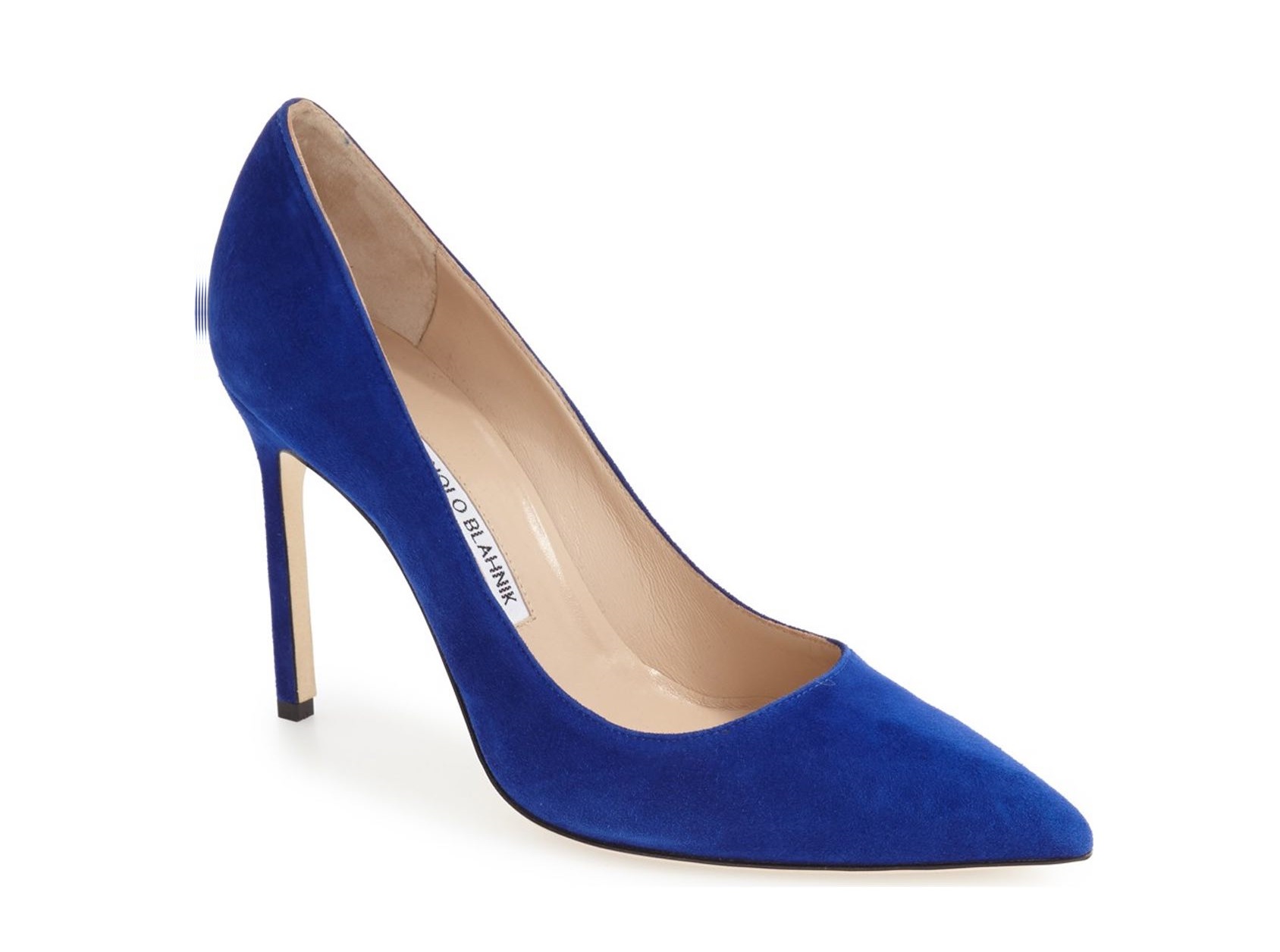
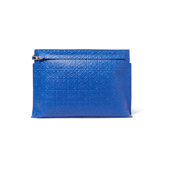
For this look I went with a primary color scheme: red, yellow, blue. A trick to color blocking is to pick one dominant color. I chose to have bits of blue from head to toe, starting from my necklace, high-waisted shorts, pumps, and clutch. The consistency pulls all the different elements together. If you want to ease into the color blocking trend, start experimenting with pops of color, such as a vibrant clutch, or bright, colored heels. Adding a little bit of color can do wonders to elevate your look.
Also, if you haven't noticed, I've been obsessed with 90's double buns, also seen in this post. I just make two braids, wrap them around, and pin the ends in place. It's super easy to do and a cute touch to any look.
Hope this inspires you to wear more color this spring!
XOXO
OUTFIT DETAILS:
Top: Forever 21
Yellow Felt Coat: Zara
Clutch: Forever 21
High Waist Shorts: Zara
Necklace: Zara
CREDITS:
Styling: Annie Cho
Photography: Grace Cho
SHOOT LOCATION:
West Hollywood, near Kung Pao Bistro
SHOP MY PICKS:


